As I was creating my blog with Next.js, I knew that I wanted to custom style my code blocks as coding was a large part of this blog, among other things.
If you have a Nextjs blog (or any React Framework blog) and want to create beautiful code blocks out of your MDX posts, then this post will show you how to do that using prism-react-renderer.
In this guide, we will see how to convert plain MDX code blocks into stylish ones you'd see in a code editor like VSCode or atom. We are going to see how to do it using Styled Components, but it is also possible to do it with vanilla CSS.
With that in mind, we need to first understand how MDX handles our code blocks, so we can then take that and make it stylish.
Understanding MDX code blocks
Before we look at how to style our code blocks it is helpful to know how MDX formats them.
When I talk about a code block in MDX, what I am talking about is the code you put between the triple back-ticks (```), the parts that look like the below.
```js
const codeBlock = () => {
  // does something
};
```;
The way MDX code blocks are formatted by the browser is they are wrapped in a pre block and then each line is split into a div. Then, each word or symbol is split into spans. This is how the styler will apply individual styles to each word or symbol. It is important to understand this, because we will need to know which HTML elements to target if we want to style our code blocks with the correct syntax highlighting.
Now, we understand how code is converted from markdown to HTML we are ready to create our component that will make our code blocks more stylish.
Creating the prism-react-renderer Syntax Highlighter Component
The first step towards making our Nextjs blogs syntax highlights prettier is by utilizing the prism-react-renderer package.
The first thing you need to do is install the package.
# npm
npm install --save prism-react-renderer

# yarn
yarn add prism-react-renderer
With that out of the way, we can now build our syntax highlighting component SyntaxHighlighter. The below code is a basic version of the component, copy the code below and we can go through what it is doing.
import Highlight, { defaultProps } from "prism-react-renderer";

const SyntaxHighlighter = ({ children }) => {
  const code = children.props.children;

  return (
    <Highlight {...defaultProps} code={code}>
      {({ className, style, tokens, getLineProps, getTokenProps }) => (
        <pre className={className} style={{ ...style }}>
          {tokens.slice(0, -1).map((line, i) => (
            <div {...getLineProps({ line, key: i })}>
              {line.map((token, key) => (
                <span {...getTokenProps({ token, key })} />
              ))}
            </div>
          ))}
        </pre>
      )}
    </Highlight>
  );
};

export default SyntaxHighlighter;
Above, we start by importing two things from prism-react-renderer. The first is the <Highlight /> component, it styles our code blocks in our MDX files. The second is the { defaultProps } object, this gets spread into the <Highlight /> component and will provide us with some default theming.
Next, we create our SyntaxHighlighter component and pass it a children prop.
Then, we declare the const code and access the mdx code through our children prop. It stores the MDX code block so we can then pass it into the <Highlight /> component.
Inside our <Highlight /> component we create an anonymous function with the props className, style, tokens, getLineProps, getTokenProps.
Within this function we target the pre block. First, we slice all lines and pass them into a div element. Within the div we are going to put each word and token into span elements. Essentially, what happens here is the getLineProps & getTokenProps apply things like the styling to your syntax.
If this was all we did our syntax highlights would now look like the below.
The reason it looks this way is because defaultProps uses the duotoneDark theme as a default. We will see how to customize themes later.
In the meantime, we can make it look much more stylish by picking out one of the many available themes react-prism-renderer has built in.
As soon as you have a theme picked out, we can add it to our syntax highlights by importing the theme from import theme from "prism-react-renderer/themes/themeName"; and adding the theme prop to our Highlight component's props.
import Highlight, { defaultProps } from "prism-react-renderer";
import theme from "prism-react-renderer/themes/nightOwlLight";

const SyntaxHighlighter = ({ children }) => {
  const code = children.props.children;

	return (
		<Highlight
      {...defaultProps}
      code={code}
			theme={theme}
     >

	// ...
Now your syntax highlights are looking great. But, what if you want to style how the actual code block looks. What if you want to add things like the language or border-radius? Well, let's see how to do that now with styled-components.
Styling prism-react-renderer Code Blocks With Styled Components
I'm going to use styled-components to show you how to style your syntax highlights. This method can transfer to any other framework of styling, I just love using styled-components with Nextjs.
To style the block surrounding the code, we need to target the pre block which, we will call PreBlock. Before we do that, we need to wrap the pre block in a div called CodeBlockContainer. The SyntaxHighlighter should now look like the code below.
const SyntaxHighlighter = ({ children }) => {
  //...

  <CodeBlockContainer>
    <PreBlock className={className}>
      {tokens.slice(0, -1).map((line, i) => (
        <div {...getLineProps({ line, key: i })}>
          {line.map((token, key) => (
            <span {...getTokenProps({ token, key })} />
          ))}
        </div>
      ))}
    </PreBlock>
  </CodeBlockContainer>;

  //...
};
Looking at the changes above, we have renamed the pre block and wrapped it in a CodeBlockContainer, this allows us to add some styling to the code blocks.
const CodeBlockContainer = styled.div`
  position: relative;
  margin-top: 48px;
  margin-bottom: 60px;
  transition: all 200ms ease-in 0s;
`;

const PreBlock = styled.pre`
  font-family: Arial, Helvetica, sans-serif;
  font-size: 18px;
  outline-offset: 2px;
  overflow-x: auto;
  margin-left: -32px;
  margin-right: -32px;
  padding: 32px;
  min-height: 50px;
  border: 1px solid rgba(230, 230, 230, 1);
  border-bottom-left-radius: 6px;
  border-bottom-right-radius: 6px;
  max-width: calc(100% + 64px);
`;
This will make your code snippets look like the below.
That is all there is to styling your code block containers. The key is to target the pre block.
On the whole, your syntax highlighting for your blog would already be looking great with just the above. But, we can take it up a level by adding things like the language or line highlights.
So let's look at how to add the language to your react-prism-renderer syntax highlights.
Adding Language to prism-react-renderer
If you look back up at how code is written in markdown you will see a little js next to the three ```. That tells markdown that the language is JavaScript, you could use CSS or HTML if the code was written in those languages. In fact there is a whole list of languages you can use.
To add language, we need to get the language value you have in your markdown and save it as a variable. Thankfully prism-react-render adds the language as a class name.
Therefore we can access it through the children prop we pass our SyntaxHighlighter component like so children_.props.className?.replace("language-", "").trim();. You will need to save the value of this expression in a const and then pass the Highlighter a language prop.
The prism-react-renderer syntax highlighter should now look like the below.
const SyntaxHighlighter = ({ children }) => {
  const code = children.props.children;
  const language = children.props.className?.replace("language-", "").trim();

  return (
    <Highlight {...defaultProps} code={code} language={language}>
      {({ className, style, tokens, getLineProps, getTokenProps }) => (
        <CodeSnippetContainer>
          <PreBlock className={className} style={{ ...style }}>
            {tokens.slice(0, -1).map((line, i) => (
              <div {...getLineProps({ line, key: i })}>
                {line.map((token, key) => (
                  <span {...getTokenProps({ token, key })} />
                ))}
              </div>
            ))}
          </PreBlock>
        </CodeSnippetContainer>
      )}
    </Highlight>
  );
};

export default CodeBlock;
The last thing we need to do is render the language variable. To do this we add a LanguageHeadingContainer inside of the CodeSnippetContainer.
const Syntaxhighligher //...

<CodeSnippetContainer>
  {language && (
    <LanguageHeadingContainer>{language.toUpperCase()}</LanguageHeadingContainer>
  )}
	<PreBlock> //...
Above, we use short circuit logic to only render the LanguageHeadingContainer if language is present in our markdown. Next, we need to add the styling for the LanguageHeadingContainer.
const CodeBlockWrapper = styled.div`
  border-top-left-radius: 0.25rem;
  border-top-right-radius: 0.25rem;
  border-width: 1px 1px 0px;
  border-style: solid;
  border-color: rgba(230, 230, 230, 1);
  background-color: rgb(231, 232, 235);
  padding: 0.75rem 1.25rem;
  margin-left: -32px;
  margin-right: -32px;
  font-family: font-family: Arial, Helvetica, sans-serif;;
  font-size: 0.875rem;
  line-height: 1.25rem;
  font-weight: 700;
  color: hsl(220deg, 23%, 5%);
  text-align: right;
`;
After that, your syntax highlights should look like the below.
The next step is to ensure we can use our SyntaxHighlighter component with our blog. This component will work with other popular MDX libraries but, I am going to show you how we do it with mdx-bundler.
Using prism-react-renderer With Mdx-bundler and Nextjs
The next step is to ensure that MDX knows to render the component. This ensures you don't have to do something like the below every time you have some code in your MDX file you want to render.
import SyntaxHighlight from "components/syntaxHighlighter";

<SyntaxHighlighter
  children={```js
const codeBlock= ()=> {
	// does something
}
```}
/>;
To manually avoid having to wrap each of your code blocks with the SyntaxHighlighter we will automatically convert them using mdx-bundler.
If you're not familiar with mdx-bundler I have a beginners guide to get you set up.
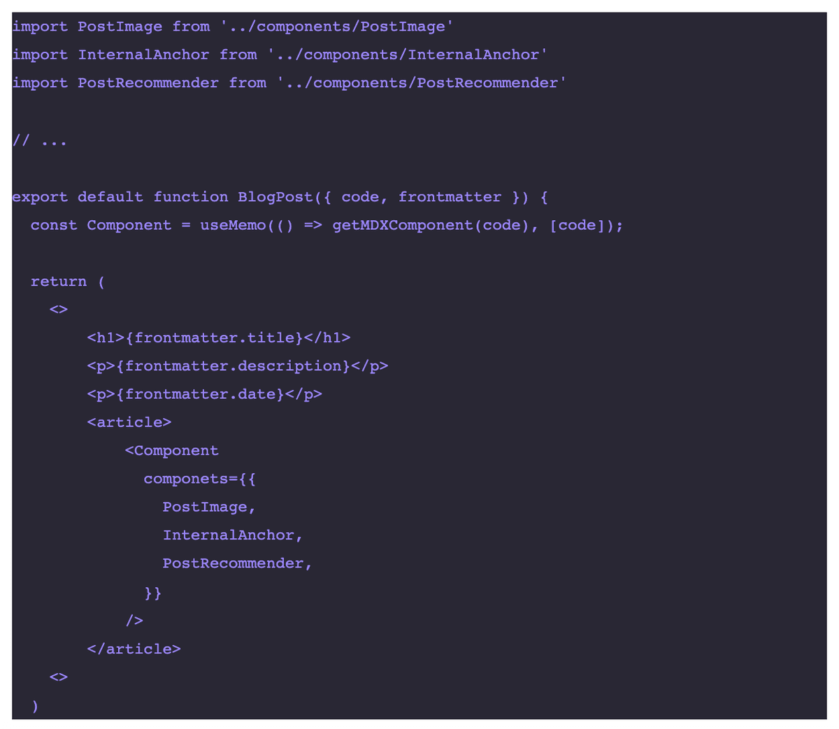
If you have MDX bundler set up with Nextjs all we need to do is add the SyntaxHighlighter component to the mdx-bundler <Component /> arguments. You will need to import the SyntaxHighlighter component into your [slug].js file.
// [slug].js

<Component
  components={{
    pre: SyntaxHighlighter,
  }}
/>
Above, we have told mdx-bundler to use our SyntaxHighligther component whenever it sees a pre block.
That is all there is to using mdx-bundler with your prism-react-renderer syntax highlighter component. As a result, you now have stylish syntax highlighting for your code blocks. But, before you go there are two more awesome things I want to show you.
Creating Custom prism-react-renderer Themes
One of the best parts about using prism-react-renderer is you can create your own themes. The benefit is you can have a theme that matches your website's design. Let's look at how to create prism-react-renderer themes now.
Making your own custom theme is similar to how you would make a VSCode theme. So to build your own theme you need to follow a JSON-based format like the below.
var myCustomTheme = {
  plain: {
    color: "#d6deeb",
    backgroundColor: "#011627",
    fontFamily: "var(--font-family-syntax)",
    fontSize: "16px",
  },
  styles: [
    {
      types: ["changed"],
      style: {
        color: "rgb(162, 191, 252)",
        fontStyle: "italic",
      },
    },
    {
      types: ["deleted"],
      style: {
        color: "rgba(239, 83, 80, 0.56)",
        fontStyle: "italic",
      },
    },
    {
      types: ["inserted", "attr-name"],
      style: {
        color: "rgb(173, 219, 103)",
        fontStyle: "italic",
      },
    },
    {
      types: ["comment"],
      style: {
        color: "rgb(99, 119, 119)",
        fontStyle: "italic",
      },
    },
    {
      types: ["string", "url"],
      style: {
        color: "rgb(173, 219, 103)",
      },
    },
    {
      types: ["variable"],
      style: {
        color: "rgb(214, 222, 235)",
      },
    },
    {
      types: ["number"],
      style: {
        color: "rgb(247, 140, 108)",
      },
    },
    {
      types: ["builtin", "char", "constant", "function"],
      style: {
        color: "rgb(130, 170, 255)",
      },
    },
    {
      // This was manually added after the auto-generation
      // so that punctuations are not italicised
      types: ["punctuation"],
      style: {
        color: "rgb(199, 146, 234)",
      },
    },
    {
      types: ["selector", "doctype"],
      style: {
        color: "rgb(199, 146, 234)",
        fontStyle: "italic",
      },
    },
    {
      types: ["class-name"],
      style: {
        color: "rgb(255, 203, 139)",
      },
    },
    {
      types: ["tag", "operator", "keyword"],
      style: {
        color: "rgb(127, 219, 202)",
      },
    },
    {
      types: ["boolean"],
      style: {
        color: "rgb(255, 88, 116)",
      },
    },
    {
      types: ["property"],
      style: {
        color: "rgb(128, 203, 196)",
      },
    },
    {
      types: ["namespace"],
      style: {
        color: "rgb(178, 204, 214)",
      },
    },
  ],
};

export default myCustomTheme;
All you need to do is copy the above code template and paste it into a mycustomTheme.js file that you can then import into the SyntaxHighlighter component. Once you've imported it, you just need to pass myCustomTheme as an argument in the Highligther's theme prop.
  <Highlight
      {...defaultProps}
      code={code}
      language={language}
      theme={myCustomTheme}
  >
That is all there is to it. You can change the colors and other values as you want to make your many prism-react-renderer themes.