At the start of the week I had no idea how to create a website, let alone a navbar. But thanks to being thrown in the deep end at my coding bootcamp I can now do both.
My coding bootcamp set me and my fellow campers the task of creating personal portfolio websites. At first I wasn’t even thinking about design. I just wanted to be able to actually make a usable website. But, as I went on and began to get more confident I started to think about design.
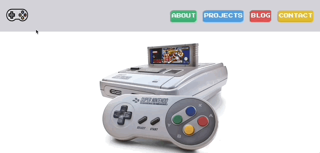
I wanted to design something that felt nostalgic. Previously I wrote about why I am learning to code and gaming as a child was a big part of one of my reasons for learning. So I took my inspiration from one of my first gaming consoles the Super Nintendo. I loved games like Kirby, Chrono Trigger and Mario World so much, I wanted to pay homage to the beautiful device.
So I took the most memorable aspects of the SNES, the controller and used it to form the design of my navbar.
In this post I’ll be showing you step by step how to make a responsive SNES styled navbar using just HTML and CSS. At the end we'll have something that looks like this.
Start with HTML
We are going to wrap the navbar in a <header> so we can easily have the logo on the left and the page buttons on the right. We want to use semantic HTML like below so our code is easier to read.
<header>
  <nav></nav>
</header>
Now that we have those in place we can get onto adding the links that will become our buttons. We are going to use a list to wrap each link.
We are going to use an unordered list using the <ul> tag. This will be the container for our list items of which we will need four, one for each button on the left side of the SNES controller.
Within these tags we are going to give each button a separate id so we can style each individually.
<header>
  <nav>
    <ul>
      <!-- y button -->
      <li id="button-one"></li>
      <!-- x button -->
      <li id="button-two"></li>
      <!-- a button -->
      <li id="button-three"></li>
      <!-- b button -->
      <li id="button-four"></li>
    </ul>
  </nav>
</header>
Within each <li> tag we will need to wrap an anchor tag <a>. Anchor tags allow us to link other pages so that when a user clicks on it, they will be taken to the corresponding page. In this demo we won’t be linking to other pages but it will affect our styling. The anchor tag is also going to allow us to give the buttons a name for each page.
Once we have our anchor tags set we are going to use placeholder hrefs values. Usually we would have an id or link to another HTML file with the page we want, but for this tutorial we just need a placeholder to make the link clickable.
<header>
<nav>
<ul>
<!-- y button -->
<li id="button-one"><a href="#">about</a></li>
<!-- x button -->
<li id="button-two"><a href="#">projects</a></li>
<!-- a button -->
<li id="button-three"><a href="#">blog</a></li>
<!-- b button -->
<li id="button-four"><a href="#">contact</a></li>
</ul>
</nav>
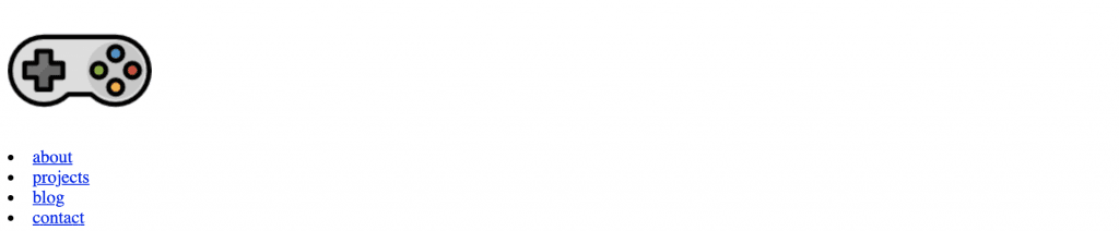
</header>Alright so at this point your navbar should look similar to this.

It looks more like a shopping list than a navbar let alone a SNES controller, but we are nearly there with our HTML. All we need to do is add a few more elements and then we will get onto styling it.
Next we are going to add is the logo image if you copy the link here you can put it in our image tag <img> src attribute.
<header>
  <!--navbar controller icon-->
  <a href="#">
    <img
      class="lazyload logo"
      src="https://image.flaticon.com/icons/png/128/860/860168.png"
      alt="logo"
  /></a>
  ...
</header>
The final thing we need to add to our HTML is the head section with some metadata. Within the <head> tag we need a link to our retro font and a meta tag to help make it responsive.
<head>
  <meta name="viewport" content="width=device-width, initial-scal=1.0" />
</head>
Okay great that's it for HTML. Now our navbar looks like below. How good, we have the bones of our project, now comes the fun part.

Style with CSS
Time to style this list and the icon to actually look like a navbar. If you’re anything like me you are probably itching to get rid of those bullet points. But, hold your horses for a second, first we need to set up the essentials before we go making it look pretty.
Step one is to set our page margin and border to 0 so the navbar takes up the full width of the page without any ugly white bits on the side. Using the * element.
/*stylesheet*/
* {
  padding: 0;
  margin: 0;
}
Now let’s style our header and the logo we used, first we want to set the background color to the grey of the controller #D3D3D9. Then we are going to use flexbox styling to set how the elements on the navbar react when the screen is resized. I won’t go into flexbox in this post but you can read more here, just know that it makes our header more mobile friendly.
/*header styling*/
header {
  background-color: #d3d3d9;
  display: flex;
  justify-content: space-around;
  align-items: center;
}

/*logo sizing for mobile*/
header img {
  width: 52px;
  height: 52px;
}
Alright now at this point we won’t see much difference in our navbar but yours should look like this.

Now it’s time to scratch our itch and remove those ugly bullet points. We’ll also get rid of the underlines on our links and change the color of the font to white.
nav ul {
  list-style: none;
}

nav ul li a {
  text-decoration: none;
  color: #fff;
}
If you ask me that is already looking way better. The next step is to line all those links elements up in a row. We could use flex again, but in this instance we are going to use inline-block as I like the way it lines up better.
We are also going to take this opportunity to style our button fonts with some retro gaming font and make it all crisp and uppercase, while setting it to be 1.5 times the size of a devices view height so it can scale up on bigger devices.
nav ul li {
  display: inline-block;
  text-transform: uppercase;
  font-family: "Press Start 2P", cursive;
  font-size: 1.5vh;
}
Okay perfect we have the text looking the way we want with all the items in a row.
Time for my favorite part, making the links look like buttons on the controller. To do that we will start with the colors. We need a green, blue, red and yellow for each of the buttons on the controller. I found a nice color pallet here for each of the buttons.
We’ll use the background-color property on each of the id's we added to each of our <li> tags in our HTML.
/*about button*/
#button-one {
  background-color: #3bb273;
}
/*projects button*/
#button-two {
  background-color: #4d9de0;
}
/*blog button*/
#button-three {
  background-color: #e15554;
}
/*contact button*/
#button-four {
  background-color: #e1bc29;
}
We have the colors right, but they don’t really look like buttons. So let’s fix that by giving them a border radius to make the corner curved.
We are also going to want to use some box-shadow to give the buttons the feeling of depth. To make it more pronounced we will use darker shades of the colors we used above.
Lastly we will use some padding on the buttons so that they don’t look so squished.
/*about button*/
#button-one {
  background-color: #3bb273;
  padding: 10px 2px;
  border-radius: 10%;
  box-shadow: -3px 3px 3px #339963;
}
/*projects button*/
#button-two {
  background-color: #4d9de0;
  padding: 10px 2px;
  border-radius: 10%;
  box-shadow: -3px 3px 3px #2f8dda;
}
/*blog button*/
#button-three {
  background-color: #e15554;
  padding: 10px 2px;
  border-radius: 10%;
  box-shadow: -3px 3px 3px #da2f2f;
}
/*contact button*/
#button-four {
  background-color: #e1bc29;
  padding: 10px 2px;
  border-radius: 10%;
  box-shadow: -3px 3px 3px #c4a31c;
}
Now they are looking more like buttons, I can practically feel the controller in my hands. But, they don’t act like buttons when we hover over them yet.
We can fix that using the pseudo class :hover and a nice transformation effect to make them look like they are being pressed down. We do that by scaling them down to 90% of their original size.
/*button click hover effect*/
nav ul li:hover {
  transform: scale(0.9, 0.9);
}
Woo, look at those buttons. They are slick.
The last bit of styling we need to do is add a little rumble effect to our controller so it moves like you’re trying to steer past a banana in Mario Kart. To do that we’ll use the pseudo class :hover again this time on our <img> element. Then we will run an animation to have it rotate.
.logo:hover {
  animation: rumble 0.3s linear;
}

@keyframes rumble {
  25% {
    transform: rotate(10deg);
  }
  75% {
    transform: rotate(-20deg);
  }
}
B-E-A-utiful, that is all the styling we need for our navbar. Before we wrap we need to make sure it the navbar is responsive.
Making it responsive
To be honest this was a lot of trial and error when I was learning. I designed the navbar with a mobile first mentality so I had some work to do to make it look good on bigger screens.
The two key screen sizes we will design for are 768px for ipad and 1024px for standard laptop screens. To do that we use media queries.
@media only screen and (min-width: 768px) {
}

@media only screen and (min-width: 1024px) {
}
Within these queries we change only the elements and properties of the elements that we want to look bigger and more spaced out on bigger screens. What we need to change size of the font, how we space the buttons and logo size in the header.
To get more space we will use justify-content: space-between on our header.
Making the buttons bigger, we will do two things, the first is adding padding and the second is increasing the font size. Finally we will put margin on the right side of each button to increase the space between them.
@media only screen and (min-width: 768px) {

header {
  justify-content: space-between;
}

nav ul li {
  padding: 10px 15px;
  margin-right: 20px;
  font-size: 1em;
}

@media only screen and (min-width: 1024px) {

header {
  justify-content: space-between;
}

nav li {
  padding: 10px 15px;
  margin-right: 20px;
  font-size: 1.2em;
}
The last thing to do in our responsive design is to make the logo also get bigger with the screen size, all we need to do here is set new width and height values. We’ll also add some padding to the left so it isn’t pressed up against the side of the browser.
@media only screen and (min-width: 768px) {
...
  header img {
    padding-left: 10px;
    width: 56px;
    height:66px;
    }
...

@media only screen and (min-width: 1024px) {
...
header img {
  padding-left: 20px;
  width: 72px;
  height: 82px;
  }
...
Oh boy! Look at the sweet responsiveness below. If you're interested in the full code to the navbar you can also check it out in the Codepen.
That’s it, now you have a SNES inspired navbar that functions like a controller with awesome button presses. I hope you enjoyed this tutorial half as much as I did making it, because I had a ball.