Theming, what the hell is it and how can we use it to make awesome web experiences.
A Theme is a preset package of graphical features like colors, fonts and buttons. Theming is storing these features in an application so that we can maintain a consistent theme across our application and until I started my internship a week ago I had no idea it existed.
I've quickly learnt from my internship that theming is used to maintain style consistency in applications and by doing so it helps to create great user experiences. Imagine that you are using a website, and the font changes style from paragraph to paragraph or it is sized different depending on what article you are reading does that sound like a good experience? Hell no.
So theming is used to help maintain consistency and recently it has been used to allow websites to easily implement things like dark mode.
In this article we are going to learn how to set up theming with styled components in React to make an awesome 90's mode theme we can toggle from our original minimal theme as Dark mode is so 2020.
Let's kick it off with the set up of our application.
Setup - Theming in React
If you've set up React Projects before you can skip most of this section, just make sure you have the dependencies installed. Otherwise follow along and we'll get it ready to go for the fun part.
We need to set up the project with React and Styled Components. To do that, we need to use [create-react-app](https://create-react-app.dev/).
Open up your terminal and use this command to create a project:
npx create-react-app theming-tutorialThe last argument, theming-tutorial, is just the name of the project which is set up as a folder for us. We could have called it anything for example 'rosebud' or 'broccoli'.
It will take a few minutes so grab a coffee and continue once it's done.
Now we need to navigate to the folder 'theming-tutorial' using the command cd theming-tutorial. In that folder is a file located in the src folder called App.js. Open that file either using the code editor of your choice or by typing open src/App.js and replace all of the content with the below.
import React from "react";
function App() {
return (
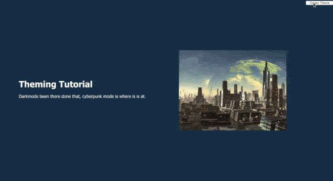
<div>
<header>
<button>Toggle Theme</button>
</header>
<div className='hero'>
<div className='hero-container'>
<div className='text-container'>
<h1>Theming Tutorial</h1>
<p>
Darkmode been there done that, cyberpunk mode is where is is at.
</p>
</div>
<div className='image-container'>
<img
src='https://images.theconversation.com/files/65451/original/image-20141125-2362-1h3qjuh.jpg?ixli=rb-1.1.0&=45&aut=format&=1200&=1200.0&fi=crop'
alt='futuristic city'
/>
<div className='corner-br'></div>
</div>
</div>
</div>
</div>
);
}
export default App;You will also need to clear everything out of the App.css and replace it with the following:
header {
  float: right;
}

.hero {
  height: 100vh;
  display: flex;
  justify-content: center;
  align-items: center;
}

.hero-container {
  display: flex;
  justify-content: space-around;
  align-items: center;
  width: 90vw;
  margin: 0 auto;
}

.text-container {
  display: flex;
  flex-direction: column;
}

h1 {
  margin: 0;
}

img {
  width: 400px;
  height: 300px;
}
This is a bare bones basic React component that we are going to modify to make our awesome nineties mode theme.
In your terminal run either of the following commands to open the application depending on whether you use npm or yarn (yarn for life!).
npm run start
##or
yarn start
You can now access the app in your browser with the URL `http://localhost:3000`.
Dependencies
Next we need to install our styled-components dependency for our application again either using npm or yarn.
npm install styled-components
yarn add styled-components
Doing so gives us styled-components. Styled-components are a flexible way to style React components with CSS. What it gives us that is really awesome for this project is out-of-the-box theming support. It does this with a wrapper component called ThemeProvider. This component gives the theme to all our other components that are wrapped within it. This will make more sense in a minute when we see it in action.
Before we jump into the tutorial section it is worth explaining a little bit on what styled components are. Put simply, styled components are a way to compartmentalise our CSS styles to individual components.
This prevents style and naming clashes, which is a huge benefit.
Another big benefit is it allows us to use props so we can pass dynamic values to it.
Now we are all set to get into actually making our cyberpunk mode effect.
Theming Tutorial
The are four key things we are going to need to create our 90's theme toggle:
Themefile - this will hold all the properties for our minimal and our 90's themes.GlobalStyle- this is where we store the global styles for the entire application.Toggler- this is the element users will see on the page to switch between themes.- Custom Hook
useCyberpunkMode- this custom hook will handle the logic behind the change of theme and the persistence of our theme in local storage.
Before we get to making the Theme file we need to create a `Styles` folder in our `src` folder. Once we have that we can get into theming.
Theme
Ok, within our Styles folder we need to create a Theme.js file, then we are going to add the code below.
export const minimalTheme = {
  body: "#192E40",
  textColor: "#fefefe",
  font: "Tahoma, Helvetica, Arial, Roboto, sans-serif",
  toggleBorder: "#5F88D9",
  imageCorner: "0",
  imageBorder: "none",
};
export const cyberpunkTheme = {
  body: "#fcee0a",
  textColor: "#05080D",
  font: "font-family: 'Maven Pro', sans-serif",
  toggleBorder: "#BF1792",
  imageCorner: "1",
  imageBorder: "#5cdcf6",
};
Here we have defined and exported our minimalTheme and cyberpunkTheme objects with our color variables for each them. Notice that we have named the keys the same in both objects but are changing the values. By having the same key names we can easily toggle between the two styles which will become more obvious in a minute.
Global Styles Component
Next up we need to create a globalStyle.js file in our Styles folder. We then need to add the following code to the file.
import { createGlobalStyle } from "styled-components";
export const GlobalStyles = createGlobalStyle`
  @import url('https://fonts.googleapis.com/css2?family=Maven+Pro:wght@400;700&display=swap');

  body {
    background: ${({ theme }) => theme.body};
    color: ${({ theme }) => theme.textColor};
    font-family: ${({ theme }) => theme.font};
    transition: all 0.50s linear;
  }


  // image styling
  .image-container {
    position: relative;

    img {
      position: relative;
      border-right: 3px solid ${({ theme }) => theme.imageBorder};
      border-bottom: 3px solid ${({ theme }) => theme.imageBorder};
    }

    .corner-br {
      position: absolute;
      left: 0;
      top: 0;
      width: 0;
      height: 0;
      border-color: ${({ theme }) => theme.body} transparent transparent;
      border-style: solid;
      border-width: 17px 17px 0 0;
      opacity: ${({ theme }) => theme.imageCorner};
	  }
	}
  `;
Let's run through what is happening here. Firstly we imported createGlobalStyle from the styled components libary, this is a helper function which will handle global styles for us. As the styled components API referenene explains normally, styled components are automatically scoped to a local CSS class and therefore isolated from other components. In the case of createGlobalStyle, this limitation is removed and things like CSS resets or base stylesheets can be applied. This method is going to let you inject your global styles into the document, which in this instance will be injected into our App.js.
In our GlobalStyles component we have defined what the background and color will be for the body of the application by using props ${({ theme }) ⇒ theme.body}. The theme.body refers to the variable named body in the Theme.js file.
The transition property is just for visual effect to make the change between thems appear smooth.
We also have some theming props on the image to style it more cyberpunk style, you'll se what I mean when we start toggling.
Now that we have our themes and our smooth transition we need to create the functionality that will allow use to toggle between the themes.
Theme toggling and Custom Hook
Okay to allow users to toggle between themes we need to add some functionality to do so. We are going to do this in a customer hook to keep our React code scalable.
But first we need to set up our App.js file so it can handle the change.
import React from "react";
import { ThemeProvider } from "styled-components";
import { GlobalStyles } from "./Styles/Globalstyle";
import { minimalTheme, cyberpunkTheme } from "./Styles/Themes";
import "./App.css";

const App = () => {
  return (
    <ThemeProvider>
      <>
        <GlobalStyles />
        <div>...</div>
      </>
    </ThemeProvider>
  );
};
export default App;
Breaking down what is happening above we have imported the ThemeProvider from styled-components, this function helper supports theming. Basically what it does is allow all styled components to have access to the themes we created in the themes file. It does this by wrapping everything in our apps return statement and it injects the theme into all styled components anywhere beneath it.
On the next line we import the GlobalStyle wrapper from ./components/Globalstyle. Then one line below we import both the minimal theme and cyberpunk theme objects from ./components/Themes.
Alright now to help make our App scalable we want to create a new component useCyberpunkMode and then write a custom hook.
To do this create a new folder in the src folder and name it Components. The create the useCyberpunkMode.js file. Then enter the code below into the file.
import { useEffect, useState } from "react";
export const useCyberpunkMode = () => {
  const [theme, setTheme] = useState("minimal");

  const setMode = (mode) => {
    window.localStorage.setItem("theme", mode);
    setTheme(mode);
  };

  const themeToggler = () => {
    theme === "minimal" ? setMode("cyberpunk") : setMode("minimal");
  };

  useEffect(() => {
    const localTheme = window.localStorage.getItem("theme");
    localTheme && setTheme(localTheme);
  }, []);
  return [theme, themeToggler];
};
First we define the component useCyberpunkMode. Then we set the state using hooks. We have set the theme state as minimal our default theme. Meaning the first time a user visits our app they will see the minimal theme.
Next we create a setMode function. This function stores the theme in the browsers local storage, what this means is that the users theme that they are using on our site will persist across sessions. In simpler terms if the user sets it to cyberpunk theme and they close the tab, when they come back it will still be the cyberpunk theme. It does this by setting the state and passing the theme to local storage.
The next function we define is themeToggler this function uses a ternary operator to check that state of the theme and toggles either cyberpunk of minimal pending which theme is currently on the browsers window.
Finally the useEffect hook checks to see if the user has previously selected a theme, if the theme has been selected we use inline If with && so it is saying if localTheme exists (that is it is true) then we use our custom hook to set the theme as what was stored in local storage.
Now we can update our App.js file to take advantage of our new customer hook.
import { ThemeProvider } from "styled-components";
import { GlobalStyles } from "./Styles/GlobalStyles";
import { minimalTheme, cyberpunkTheme } from "./Styles/Themes";
import "./App.css";
import { useCyberpunkMode } from "./Components/useCyberpunkMode";

function App() {
  const [theme, themeToggler] = useCyberpunkMode();
  const themeMode = theme === "minimal" ? minimalTheme : cyberpunkTheme;

  return (
    <ThemeProvider theme={themeMode}>
      <GlobalStyles />
      <div>
        <header>
          <button onClick={themeToggler}>Toggle Theme</button>
        </header>
        <div className='hero'>
          <div className='hero-container'>
            <div className='text-container'>
              <h1>Theming Tutorial</h1>
              <p>
                Darkmode been there done that, cyberpunk mode is where is is at.
              </p>
            </div>
            <div className='image-container'>
              <img
                src='https://images.theconversation.com/files/65451/original/image-20141125-2362-1h3qjuh.jpg?ixli=rb-1.1.0&=45&aut=format&=1200&=1200.0&fi=crop'
                alt='futuristic city'
              />
              <div className='corner-br'></div>
            </div>
          </div>
        </div>
      </div>
    </ThemeProvider>
  );
}

export default App;
Now we import our custom hook and destructure the theme and themeToggler props, and set it with the useCyberpunkMode function.
Let's try and toggle this bad boy.
Now there you have it, your very own cyberpunk theming website built in React with styled components.
I you have any questions on the build reach out to me on my twitter here.