Developing an understanding of the CSS position property is important if you want to become really good at CSS. However, it can be one of the more frustrating experiences for a beginner.
In building my Developer portfolio I found I didn’t really understand the CSS position property, I just randomly tried different combinations of positions together until I got something I was kind of happy with. But, most of the time it was just garbage and it had me pulling what little hair I have left out.
In this article, I am going to try and save you the pain of not knowing what you are doing with the position property. You are going to learn how each of the values of the CSS position properties work, so you can get really good at CSS.
To understand the position property and the values associated we first need to make sure we understand how elements are positioned on a webpage.
Flow Layout
The way elements are positioned on a page is called the normal flow, or flow layout. It is the way elements are displayed on a page by default. Basically the flow is the set of all elements on your page working together and each one knows about all the others.
Now, CSS treats each HTML element as its own box, you might have heard of this referred to as the box model. Block-level items (things like headings, paragraphs or divs) by default start on a new line while inline items (images or spans) sit within the surrounding content on the same line. The default layout of elements in this way is called the normal flow of a document, but CSS offers us a powerful tool in the position property to override the normal flow.
Let's see what the position property does.
Position Property
The CSS position property sets how an element is positioned in a document. We can use it to determine how we want to position individual elements based on the values you give the position property.
The position property has five options available.
- Static
- Relative
- Absolute
- Fixed
- Sticky
We are going to cover all 5 of these values, but before we do we need to understand the placement properties and how they affect positioning.
Placement Properties
By itself the position property doesn’t do much. We need to use the placement properties (just what I call them not the official name) to tell the document exactly where the element should be placed. There are four main properties to do just that.
- Top
- Left
- Right
- Bottom
Each of these properties define how much the element's position should be adjusted from its default and in which direction it should be adjusted. When we look at the position values below and the examples it will become more clear how these work.
Position Property Values
Static Positioning
Static positioning is the default value for the position property. That is the elements on the page appear in the order expected by normal flow. The placement properties top, left, bottom and right do not affect an element that has position: static.
It can often be useful to set the position property to static even though it is the default value. An example of when you might want to do this is when you want to override a position value you have set elsewhere.
Let’s look at an example to see that position static has no effect on the element with this property.
<div class="parent-box">
  <div class="box-original">
    <div class="box-1"></div>
  </div>

  <div class="box-original">
    <div class="box-2"></div>
  </div>

  <div class="box-original">
    <div class="box-3"></div>
  </div>
</div>
In the above example we have three divs each in a parent container with the class box-original.
Let's add position: static to the div with the class box-2and give it box some values for top and left.
.box-2 {
  position: static;
  top: 10px;
  left: 10px;
  border: 1px solid black;
  background-color: mediumpurple;
  width: 100px;
  height: 100px;
  text-align: center;
  display: inline-block;
  align-self: center;
  margin-left: -1px;
  margin-top: -1px;
}
Below is the result of the changes we have made.
Did you see that even though we have used the position property and the placement values that it has no effect on the element? You now know that the static value is the default and that the placement values do not affect elements with position: static.
Let’s look at the first value that does affect the position of an element in the flow of the document.
Relative Positioning
Relative position means that an element is positioned relative to its original position in the normal flow. By setting an element to just have position: relative nothing will happen. We will need to use the placement properties to change how the element is positioned relative to its original position.
Basically when you set a HTML element to position: relative, it will remain in the flow of the layout. But, by using the placement properties you can move the element around. Let’s look at an example to cement your understanding of the relative position.
We are going to replace the position: static with position: relative.
.box-2 {
  position: relative;
  top: 10px;
  left: 10px;
  border: 1px solid red;
  background-color: mediumpurple;
  width: 100px;
  height: 100px;
  text-align: center;
  align-self: center;
  margin-left: -1px;
  margin-top: -1px;
}
The result of the change is below.
You can see that the purple square element has been positioned relative to where it was initially positioned the grey square. In the example above it is 10px from the top and 10px from left of where it was originally meant to be positioned in the normal flow. However, the element remains in the normal flow of the document and the offset is applied relative to its original position. Make sure to remember this as we move on to the other position values.
Absolute Positioning
Absolute positioned elements are removed from the normal document flow, and the space that the element was originally occupying is no longer reserved for that element. I like to remember it by saying it is ‘absolutely not there’.
When the element is given position: absolute all other elements behave as if that element is no longer in the document. Therefore, there is no space reserved for that element in the page layout. This can then be a really powerful tool for moving HTML elements around.
An important point and something that stumped me when I was learning is that an element with position: absolute is positioned relative to its closest positional ancestor. What this means is that for absolute positioning to work, the parent element must have a position property value other than the default of static.
This is a crucial point to take note of, because if the closest parent element does not have a position property, the element with the absolute position will position relative to the next parent element that has a position property value. If there is no element with a position property value the element will be positioned relative to the html or viewport element. Not knowing this is what can cause so much pain when trying to position elements in the document.
We can move the absolute positioned element around just like any other CSS position property by using the placement properties. Using the top, left, bottom and right properties, you determine where the element will be placed relative to the first parent element in the hierarchy that has a position property other than the default position: static.
Let's get back to our example. We are now going to change the position property of the second box element to position: absolute. Before we look at the change and the result, check the previous pen to see what the position of the parent-box element is.
.box-2 {
  position: absolute;
  top: 30px;
  left: 150px;
  border: 1px solid red;
  background-color: mediumpurple;
  width: 100px;
  height: 100px;
  text-align: center;
  align-self: center;
  margin-left: -1px;
  margin-top: -1px;
}
The results of the changes are below.
Here you will see that no space was created in the document for the element. In fact the space has collapsed and the other elements are acting like it isn't even on the page. This is because the element is now positioned relative to the parent-box element.
Fixed positioning
Fixed positioning works like absolute positioning in that it is removed from the normal document flow, and the space that element was originally occupying is no longer reserved for that element.
Fixed positioned elements are positioned relative to the viewport. What this means is that when you scroll down the page, the element remains in its original location on the page. This is often used for navigation bars, which no matter where the users scrolls on the page always remain visible at the top of the page.
We are going to change the position of box-2 from position: absolute to position: fixed. We are also going to change the value of the top property to 0 and remove the left properties value. We have also added some more boxes to show you the effect as you scroll.
.box-2 {
  position: fixed;
  top: 0px;
  border: 1px solid red;
  background-color: mediumpurple;
  width: 100px;
  height: 100px;
  text-align: center;
  align-self: center;
  margin-left: -1px;
  margin-top: -1px;
}
The results of the changes are below.
As you can see from the example the purple box element is now fixed at the top of the page, much like a navigation bar we've built in the past. This is because we have set the position property to fixed and set it 0 from the top of the page.
When using the CSS position property with a fixed value it’s important to note that it takes up the viewport space you specify the whole time the user is on the page. This can affect a users experience especially on mobile devices where screen space is limited. So ensure you are thinking about how you use it across all devices with your media queries.
Sticky Positioning
The sticky positioning value is positioned according to the normal flow of the document, yet it is also a mix of both position relative and position fixed. What I mean by this is that it behaves as a relatively positioned element until the page reaches a set scroll point then it will behave as a fixed position element.
Let’s look at a new example below to see that when the element reaches a position on the page it changes to a fixed position element. We are going to give the dt tag the position value sticky and the property top with a value of 3px meaning it will be 3px from the top of the page.
dt {
  background: #007fff;
  border-bottom: 1px solid yellow;
  border-top: 1px solid yellow;
  color: yellow;
  margin: 0;
  padding: 2px 0 0 12px;
  position: sticky;
  top: -1px;
}
Try scrolling through the result below to see how sticky works.
In the example above you can see that the dt tags (the lines in blue) stick until we reach the point of the next dt tag. Once we reach that point the next dd tag becomes the sticky element. So, the dt elements are positioned in the normal flow of the page, but when you reach its position when scrolling, its position becomes fixed. It sticks to that position and stays there as you scroll until the next dt tag takes the fixed position.
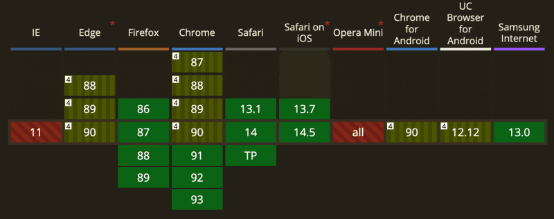
Be careful with the sticky positioned property as it is not yet universally supported by all browsers at the time of writing this (those pesky IE users). You can always check if something is support by checking out caniuse.com.
Where does Z-index fit in
Z-index is a CSS property that let’s you set the z-order of a positioned element. This means that any element that you set with a position property value other than static can be positioned along the z-index plane.
Basically the z-index lets you have control over how these elements are ordered and therefore how they overlap each other. Essentially, it is you deciding which elements should appear at the front and which should appear at the back.
Elements with higher value z-index properties are displayed in front of elements with lower value z-index properties.
Let's look at an example below, I am going to show you the HTML order to show you that if we use z-index the order doesn't matter we can determine their position from front to back.
<div class="parent-box">
  <div class="box box-1">z-index:4</div>
  <div class="box box-2">z-index:1</div>
  <div class="box box-3">z-index:2</div>
  <div class="box box-4">z-index:5</div>
  <div class="box box-5">z-index:3</div>
</div>
We then give each the box class a position of fixed which now allows us to change the z-index of each of the box elements. The results of doing so are below.
As you can see from the results, the higher z-index elements are in the front and the lower ones are at the back.
Conclusion
To summarize what we’ve learned, the CSS position property is a powerful tool that lets you change the normal flow of a document, by determining how elements should be placed on a page.
You have five position properties to work with.
- Static
- Relative
- Absolute
- Fixed
- Sticky
You set the position of the element by using the top, left, bottom and right properties and by specifying how far away from that point the element should be.
You can also set the position of the element on the z-index if you have given it a position property value other than the default static. The higher the values are displayed in the front and the lower values are displayed in the back.
The best way to get better at CSS position property is to play around with it. Give the pens I used here a try and play around with each property by giving them different values or changing the parent elements.
If you like this article or want to discuss any parts of it please reach out to me on twitter or check out my contact page to find out how to speak with me.